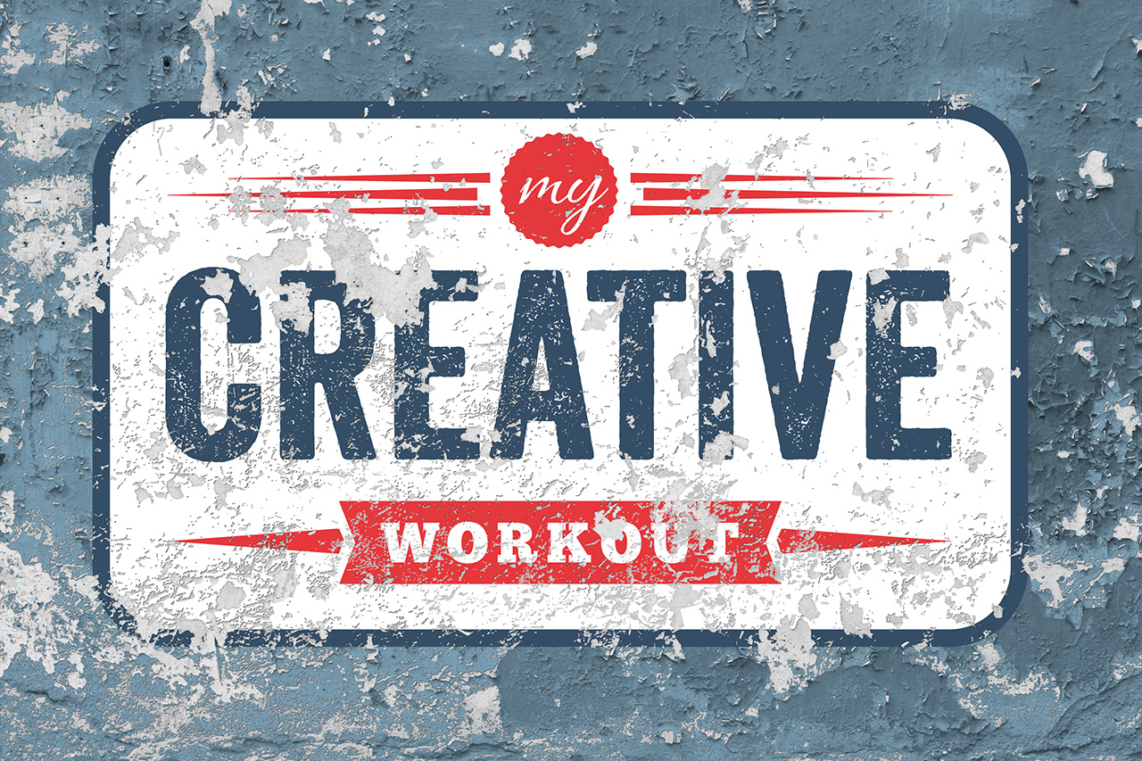
I found this graphic that I created some time ago, when I was in the early stages of creating this website. At that time I was experimenting with different directions that I wanted to take My Creative Workout. I really love the retro look of this logo treatment and seeing it again has motivated me to embark on a journey to changing the graphic identity of this website. Back when I started, I decided to build My Creative Workout as a self-hosted WordPress site. I went with the Genesis Framework from StudioPress and chose the Modern Studio Pro Theme with very few changes to the out-of-the-box design. Now, I’ve decided that it’s time to move beyond the stock look and feel of the Modern Studio Pro theme and dig much deeper into WordPress and CSS. Over the coming weeks and months I’ll be making changes to the design of this site. Some changes will be subtle, while others will be much more apparent. My hope is that the end result will be something that really represents what I’ve always had in mind for My Creative Workout.
Leave a Reply