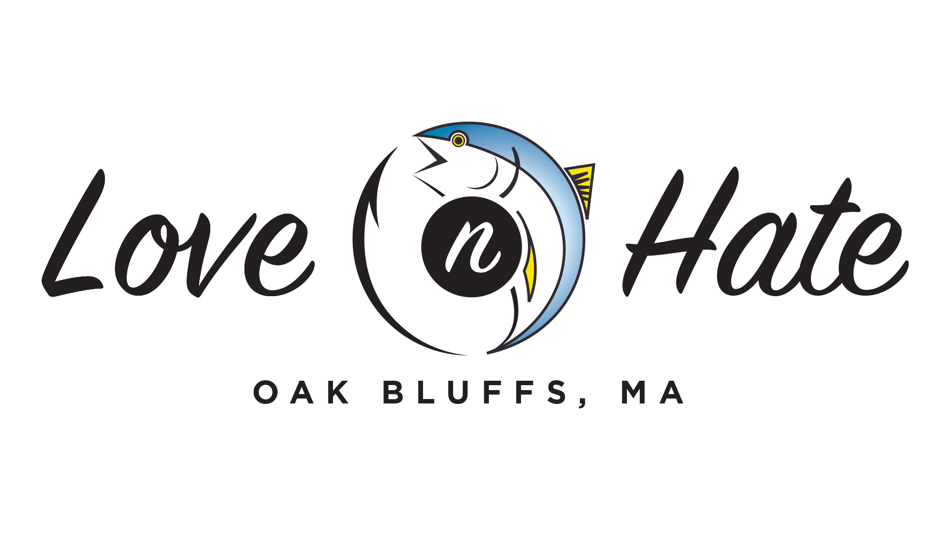
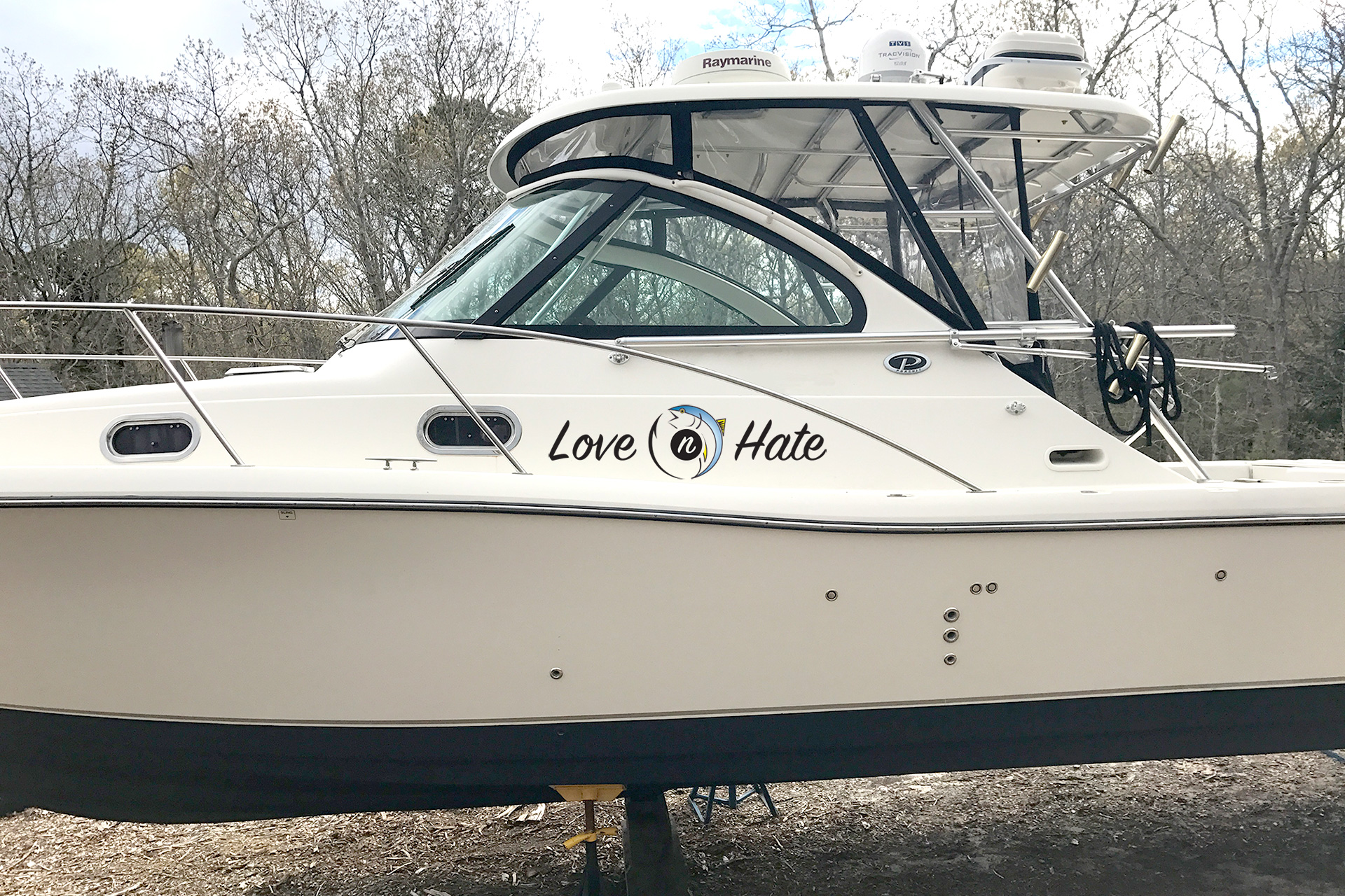
Some time ago, I was asked to design a boat name graphic for a client from Martha’s Vineyard. The name of the boat is the Love n’ Hate which has an inside meaning to the owners. That being said, the client wanted the graphic to communicate the primary activity that the boat is used for, which is fishing. I really enjoyed designing this logo and hope to get more opportunities to take on similar projects designing boat name graphics in the future.
Making Space at Home for Creative Work
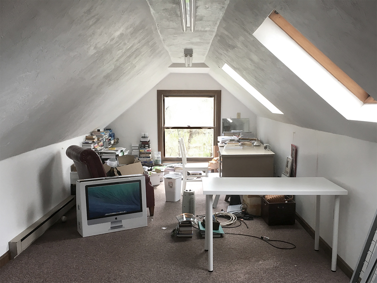
As an introvert, I’ve come to terms with the fact that it’s important for me to spend time alone with my thoughts regularly for my own sense of balance and peace of mind. It’s in these moments of solitude that I’m best able to focus on doing any kind of creative work. Finding space in our house for this purpose has always been a challenge.
We’re a family of four that lives in a ranch style home with three bedrooms. I have a desk set up in our living room that I use to deal with tasks like paying bills or catching up with email. Unfortunately, there’s just too much activity that happens in this part of the house throughout the day for me to use this space on a regular basis. Sometimes, when it’s too busy to sit at my desk in the living room, I’ll hole up in our bedroom. But because our bedroom is so close to the kitchen, it still becomes difficult to not get distracted. [Read more…]
Changing It Up
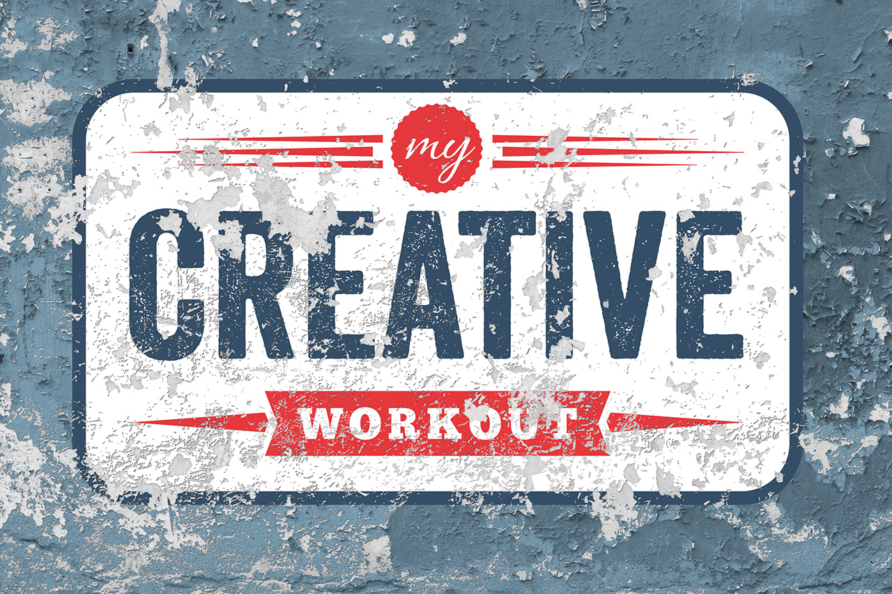
I found this graphic that I created some time ago, when I was in the early stages of creating this website. At that time I was experimenting with different directions that I wanted to take My Creative Workout. I really love the retro look of this logo treatment and seeing it again has motivated me to embark on a journey to changing the graphic identity of this website. Back when I started, I decided to build My Creative Workout as a self-hosted WordPress site. I went with the Genesis Framework from StudioPress and chose the Modern Studio Pro Theme with very few changes to the out-of-the-box design. Now, I’ve decided that it’s time to move beyond the stock look and feel of the Modern Studio Pro theme and dig much deeper into WordPress and CSS. Over the coming weeks and months I’ll be making changes to the design of this site. Some changes will be subtle, while others will be much more apparent. My hope is that the end result will be something that really represents what I’ve always had in mind for My Creative Workout.